Alexa+ MCP Design Guide
Add-ons enable partners to integrate their products and services directly into Alexa+. Customers interact with add-ons through inline components, fullscreen views, and voice responses that integrate seamlessly into the Alexa+ interface.
Alexa+ supports two integration paths for partners.
-
MCP add-ons let you deploy your own UI directly into the Alexa+ interface. You build and ship the experience, and Alexa renders it.
-
Integration with Alexa categories brings your API-based or MCP-based experience directly into an existing Alexa+ category. This path requires coordination with the Alexa+ team during onboarding.
How customers reach you
By default, customers activate your add-on through direct named invocation. For example, a customer might say "Alexa, open <invocation name>" or "Alexa, book me a hotel next week in Portland with <invocation name>."
Alexa offers two paths to unlock more direct access:
-
High certification quality. Add-ons that meet Amazon's quality bar earn name-free invocation, letting customers reach your experience without naming your add-on explicitly.
-
Category integration. Integrating with an existing Alexa+ category (Food Ordering, Travel Planning, Ride Booking) automatically top-levels your add-on for inclusion within that category's flows.
What Alexa handles
-
Voice response generation. Speaking behavior can't be controlled by the developer.
-
Conversation continuity, including resumption after interruptions.
-
Default rendering of data-only responses through Alexa's native interface.
-
Voice-only delivery on devices without a screen.
-
Ensuring the customer request is routed to the relevant add-on; helping the customer choose which add-on to use when more than one are relevant to their request.
What you control
-
Your tool logic and the data you return.
-
Your UI payload, when you choose to provide one.
-
Brand expression within the Alexa design system.
-
Ingress and egress controls for fullscreen experiences.
A note on rendering
If you provide a UI payload, Alexa renders it directly. If you return data only, Alexa renders it through Alexa native components or as a voice-only response, so your data appears consistently with the rest of Alexa+.
What makes a great experience on Alexa

An add-on should do at least one thing better because it lives in Alexa+. Customers come to Alexa for hands-free, eyes-free task completion in the spaces where they live and work: kitchens, living rooms, cars, and on the go. A great add-on meets them in that context, not by porting a screen-first product into a voice-first surface, but by extracting the moments where Alexa can deliver a faster, simpler, or more natural outcome than any other channel.
Four principles define a great add-on experience.
1. End-to-end task completion
Customers come to Alexa to finish something, not to start a journey they'll complete elsewhere. A great add-on resolves the customer's intent within the conversation, surfacing only the inputs Alexa needs to act and confirming the outcome clearly. Avoid handoffs to a phone, app, or website unless the task genuinely requires it. If your service typically takes ten taps and three screens, identify the two or three steps that actually need the customer's input, and let Alexa handle the rest.
2. Simple, glanceable metadata
Alexa surfaces are read at a distance, often in motion, and frequently with divided attention. Show only the information the customer needs to make the next decision. One title, one or two supporting fields, one clear action. Strip the rest. Density that reads well on a phone reads as noise on an Echo Show across the room.
3. Text optimized for far-field and ambient reading
Customers read Alexa screens from across the room, while cooking, while walking past, while doing something else. Use the 1.6 typography scaling ratio described in Visual Foundations. Favor short, declarative copy over long descriptions. Write labels and button text that hold up when scanned in under a second. If a customer has to lean in to read it, it's too small or too dense.
4. Coherency with the Alexa design language
Your add-on should feel like a natural part of Alexa+, not a foreign object embedded in it. Adapt your brand to Alexa's tokens, spacing, and component patterns. Use brand expression where it earns its place: accents, badges, primary actions. Let Alexa's visual system handle the rest. Customers should recognize your service through the experience, not through visual disruption.
What "great" looks like in practice
A great add-on gives customers:
-
Something new to know. Information they couldn't easily get elsewhere, or that's faster to ask for than to look up.
-
Something new to do. A task that's simpler, faster, or more natural by voice than through a screen-first product.
-
A better way to see something. A presentation that's clearer, more glanceable, or better suited to the moment than the customer's existing tools.
If you can't describe what your add-on does better because it runs inside Alexa+, keep iterating before submitting for certification.
The conversation surface

Alexa+ uses a turn-based conversational model. Every customer turn produces a response from Alexa (voice, screen, or both), and your add-on participates one turn at a time.
Voice and screen are co-authored
Every MCP response produces a voice response and, where supported, an on-screen response. Alexa incorporates your returned data into what it says. The customer's utterance and the quality, depth, and breadth of your data shape the spoken reply. You influence Alexa's response through the data you return, not by scripting it directly.
Interruption and resumption
After interruptions, whether initiated by the customer or the system, Alexa resumes the conversation by referencing conversation history. Design your tool responses to remain intelligible when re-entered mid-flow.
Continuity across turns
Your add-on may be invoked across multiple turns within a single conversation, and customers may move between add-ons or shift topics without exiting. Treat each tool response as self-contained while assuming Alexa will weave it into the broader conversation.
Display modes
Display modes are the surfaces partners use to render add-on experiences in Alexa+. Each mode is designed for a specific type of interaction, from quick confirmations to immersive workflows. Using these consistently helps experiences stay simple and predictable.
Inline (default)
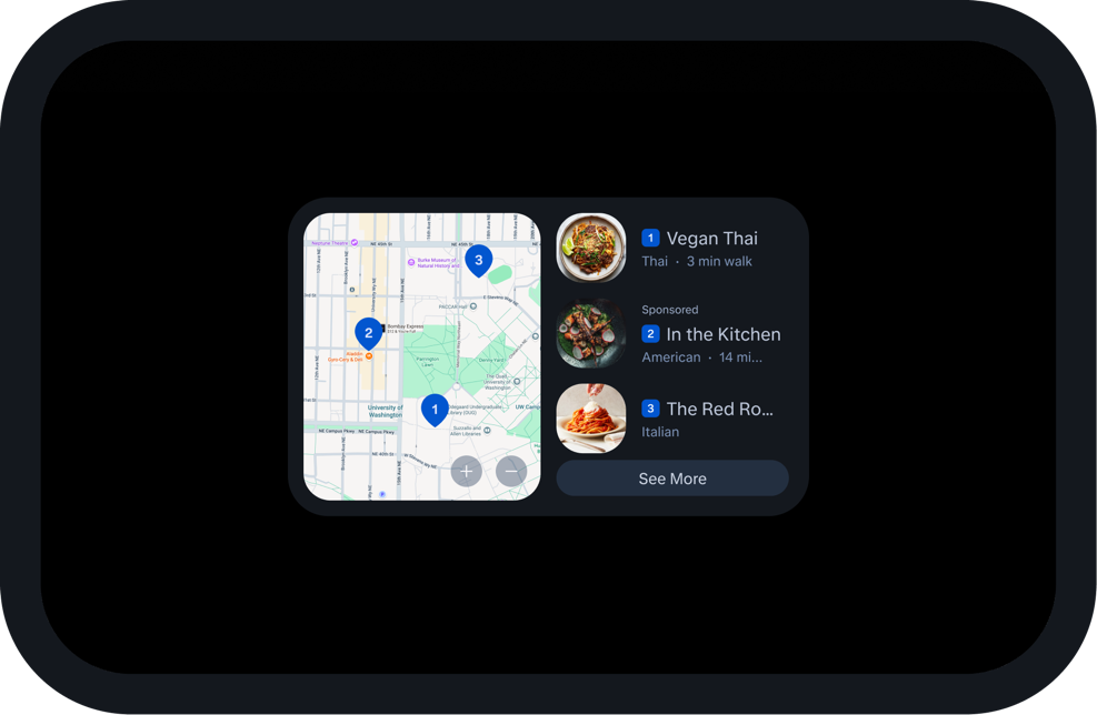
Your component renders directly in the conversation. This is the default behavior for any MCP response with a UI payload. You don't opt into inline. It's where your experience lives unless you explicitly request fullscreen.
When to use:
-
Confirmations, summaries, and single-decision flows.
-
Content that complements the spoken reply.
-
Most add-on responses.
Fullscreen

An expansion of the inline fragment that provides more real estate for complex interactions and higher content density. Fullscreen isn't a separate surface. Treat it as the same experience with more room.
When to use:
-
Games.
-
Panning and zooming interactions.
-
Information-dense displays such as schedules, charts, and detailed lists.
-
Complex multi-step interactions.
As the developer, you provide ingress and egress controls for fullscreen experiences. Refer to the provided components for Alexa best practices.
Hydrated (default when no UI payload is provided)
If you return data only, with no UI payload, Alexa renders that data through its native interface. This ensures your product's data appears consistently with other Alexa+ experiences. Hydration is the default behavior whenever your response omits a UI payload.
Voice-only
Used automatically on devices without a screen. No mode selection is required. Your tool's data must remain intelligible without any visual support. Voice-only is the always-on baseline that every add-on ships with.
Choosing a mode
Modes you specify are generally respected on Alexa+ devices with screens. If a specified mode isn't supported on a given device, Alexa falls back to text rendering or hydration. Don't move customers between inline and fullscreen frequently or without a discernible reason. Each mode change is a context shift. Reserve mode changes for moments where the change earns the disruption.
Layout and rendering
How Alexa renders your payload
Alexa renders your UI payload as large as possible within the device canvas, and natively applies CSS scaling to adaptively fit your content inside the native viewport. You don't need to design for specific device dimensions. Alexa handles sizing for you.
Viewport types
Two viewport types scale your design programmatically across Alexa device classes.
-
Block viewport. Scales and scrolls horizontally. Recommended for native Alexa+ designs.
-
Card viewport. Scales and scrolls vertically. Primarily intended for web interfaces. For Alexa screen-based devices, adapt Card patterns to Block treatments where possible.

Orientation Determines Viewport:
-
Designs that are taller than they are wide render as a Card.
-
Designs that are wider than they are tall render as a Block.
You don't need to design for specific breakpoints. Alexa snaps your viewport to an established grid, then applies CSS scaling to each component.
Device support
For devices not supported by Alexa+, see the Compatibility of Alexa+ with Alexa Built-in Devices documentation. For the Alexa+ web experience, see Alexa.com.
Visual foundations

MCP add-ons are responsible for finding their own visual language. Adapt yours to Alexa as much as possible. Three adaptations matter more than any single token choice: typography at a 1.6 scaling ratio relative to typical web and mobile sizes, reduced content density with fewer metadata fields per item, and a consistent bias toward simplicity over information richness. Alexa customers benefit most from clarity at a glance.
Designing for Alexa's surface
Alexa is a low-content-density, low-resolution surface. The most important adaptations partners can make to their existing visual language are:
-
Typography at a 1.6 scaling ratio relative to typical web and mobile sizes.
-
Reduced content density. Use fewer metadata fields and less per-card information.
-
Less is more. Prioritize a simple, highly readable experience over information richness.
These adaptations matter more than any single token choice. Alexa customers benefit most from clarity at a glance.
Best practices
-
Support light and dark mode natively. Design and test both.
-
Use appropriate padding on all components.
-
Use card backgrounds with rounded corners.
-
Apply adaptive breakpoints with styling overrides for mobile web and Echo family devices.
Token reference
Use these values as the foundation for adapting your brand to Alexa.
Typography
| Token | Size |
|---|---|
| textStyleDisplay1 | 48px |
| textStyleDisplay2 | 40px |
| textStyleDisplay3 | 32px |
| textStyleDisplay4 | 28px |
| textStyleDisplay5 | 24px |
| textStyleHeadline1 | 20px |
| textStyleHeadline2 | 18px |
| textStyleBody1 | 16px |
| textStyleBody2 | 14px |
| textStyleBody3 | 12px |
| textStyleLabel1 | 10px |
| textStyleLabel2 | 8px |
Spacing
| Token | Value |
|---|---|
| spacing4XSmall | 2px |
| spacing2XSmall | 6px |
| spacingXSmall | 8px |
| spacingSmall | 12px |
| spacingMedium | 16px |
| spacingLarge | 20px |
| spacingXLarge | 24px |
Shape (Corner Radius)
| Token | Value |
|---|---|
| shapeRoundedRectXSmall | 4px |
| shapeRoundedRectSmall | 8px |
| shapeRoundedRectMedium | 12px |
| shapeRoundedRectLarge | 16px |
| shapeCircle | 9999px |
Iconography
| Token | Value |
|---|---|
| action-small-icon | 16px |
| action-medium-icon | 20px |
| action-large-icon | 24px |
Components and patterns
Four templates define how content is arranged and presented across Alexa surfaces. Don't invent alternatives — customers learn to scan and act on these shapes, and consistency is what makes Alexa+ feel coherent.
List
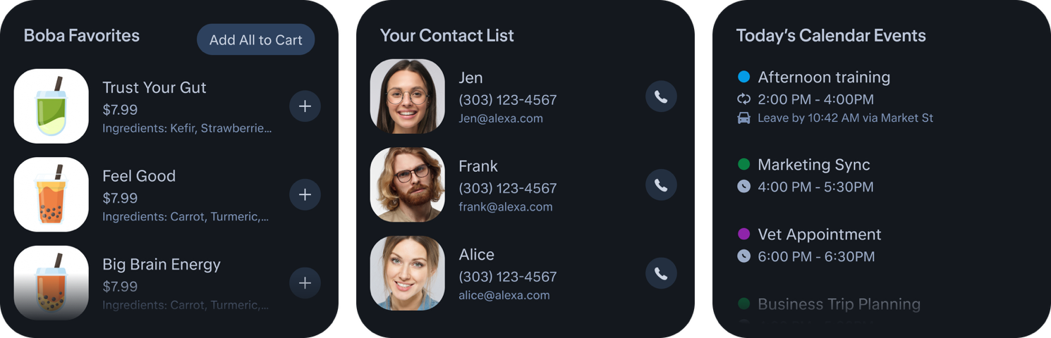
A vertical stack of items, top to bottom. Use it when presenting content in list format: shopping lists, calendar events, to-do items. Optimized for homogenous content where every item shares the same structure.
A List consists of an optional Header that contextualizes the content, optional Selection Controls (tabs to switch views, filter chips to refine), and the required item stack. On transcript surfaces (EFD, Mobile, Web), a "See More" button opens the full list in an overflow surface.
Common uses: media (music, audiobooks, movies), products (shopping, food ordering), points of interest, calendar events, to-do items, contacts, payment methods, devices, and settings.
Carousel
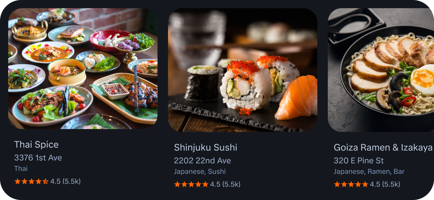
A horizontal row of items, left to right. Use it when presenting related content side by side: restaurants, events, stocks. Like the List, optimized for homogenous content where users benefit from scanning across multiple items at once.
A Carousel consists of an optional Header, optional Selection Controls, and the required row of items laid out horizontally, with overflow accessible by scrolling.
Return 3 to 5 items in inline mode. Start delivering the first item within 500ms. If you can't hit that budget, reduce the initial set and lazy-load additional results behind a "See more" action. Put your strongest result first.
Common uses: detail rows (points of interest, shopping, events, news briefings, recipes) and text-only rows (stocks and indices).
Card

A single entity presented with an image and optional action buttons. Use it when one result warrants individual focus and you want to encourage the user to explore further. Best for browsing, comparing, and engaging with richer content: events, recipes, news articles, points of interest, movies, songs, and shopping results.
Two interactions are available. Tapping an action button triggers a domain-defined flow — behavior is set at the domain level, not at the template level. Tapping the card itself (outside the buttons) opens an expanded view on another surface (lightbox, side panel, or bottom sheet) showing all information without pruning. For domains with a dedicated experience, such as recipes, this opens the domain experience instead.
Map
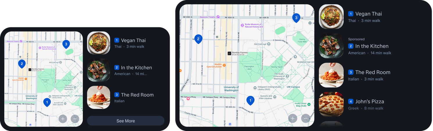
A ranked list of local points of interest alongside a map that plots their locations. Use it for location-based queries: restaurants, tourist attractions, entertainment venues.
Layout adapts to grid dimensions. When rows (Y) is greater than or equal to columns (X) plus 2, the POI list sits below the map (portrait). When rows (Y) is less than columns (X) plus 2, the list moves to the right of the map (landscape).
Compact (Inline) Mode
In compact (inline) mode, the map occupies the left and a ranked list of 3 results sits to the right. Each item shows a numbered badge matching the pin on the map, thumbnail, name, category, and walking distance. A "See More" button expands to fullscreen. Use compact as the default for any multi-result location query.
Expanded (Fullscreen) Mode
In expanded (fullscreen) mode, the map fills most of the width with the results list as a sidebar. Show 4 to 6 results. This is one of the valid fullscreen use cases — the map pans and zooms.
Sponsored Items
Surface sponsored items with a "Sponsored" label above the item name in textStyleBody2, muted — never as a badge on the image. Place them at position 2, never position 1. Numbered pins and list items always correspond; never use one without the other.
Quality bar and certification
Amazon holds a high quality bar in the certification process to approve and promote add-on experiences. Add-ons that meet the top quality bar earn top-level name-free invocation, giving customers more direct access to your experience.
You are responsible for maintaining, optimizing, and debugging your MCP app UI. Automated checks and certification guidance are forthcoming, but won't address third-party quality issues specific to your implementation.
Starting Points for Your Own QA
-
Follow industry UI principles. Establish clear visual hierarchy and use design elements consistently.
-
Reference the templates in the MCP GitHub. Alexa-themed templates are coming later.
-
Build your UI per the MCP UI implementation guidelines.
Reference
Prerequisites
Before using these guidelines, confirm you have:
-
An Amazon Developer account.
-
An MCP server already set up.
-
Reviewed the Alexa+ MCP Add-ons Developer Guide.
External References
-
MCP Guidelines for creating an app
-
MCP UI implementation guidelines
-
MCP app templates
-
Alexa+ device compatibility
-
Alexa.com
MCP tool design best practices
Alexa+ acts as the MCP client that interprets and calls your tools. Well-designed tools route correctly, extract the right parameters from customer utterances, and deliver the intended experience. Poorly designed tools cause misrouting, excessive server calls, or dead-end conversations.
Design for one-shot extraction
Alexa+ expects tools that accept all relevant constraints in a single request. A customer might say "Find me a pet-friendly hotel in Austin for December 5-7 under $150 with parking." Your tool schema should accept all of those constraints as parameters in one call — not require sequential calls to narrow down results.
Recommended:
{
  "name": "search_hotels",
  "description": "Use this tool when a customer is looking for hotels or accommodation. Returns a list of available hotels matching the specified criteria. Supports filtering by location, dates, price, amenities, and guest count.",
  "inputSchema": {
    "type": "object",
    "properties": {
      "destination": { "type": "string", "description": "City or region name" },
      "checkInDate": { "type": "string", "description": "Check-in date in YYYY-MM-DD format" },
      "checkOutDate": { "type": "string", "description": "Check-out date in YYYY-MM-DD format" },
      "maxPricePerNight": { "type": "number", "description": "Maximum price per night in USD" },
      "guests": { "type": "integer", "description": "Number of guests" },
      "amenities": { "type": "array", "items": { "type": "string" },
        "description": "Required amenities: parking, pool, pet-friendly, wifi" }
    },
    "required": ["destination"]
  }
}
Not Recommended (multiple sequential tools):
{ "name": "get_destinations", "description": "Gets available destinations" }
{ "name": "get_hotels", "description": "Gets hotels for a destination" }
{ "name": "filter_hotels", "description": "Filters hotels by criteria" }
The second approach forces multiple round trips and gives Alexa+ no way to fulfill the customer's request in a single turn.
Write descriptions for the AI, not for humans
Your tool descriptions directly determine when and how Alexa+ calls your tool. Write them as if briefing a new team member who has never seen your service.
Every tool description must specify:
-
When to call it — the exact customer intent or scenario
-
What it returns — the shape and type of data
-
What it does NOT do — boundaries that prevent misrouting
Good:
"Use this tool when a customer is searching for hotels or accommodation. Accepts destination, check-in/check-out dates, guest count, price range, and amenity. Returns a ranked list of available hotels with nightly rates, ratings, and thumbnail images. Does not handle booking confirmation, use book_hotel for that."
Bad:
"Searches hotels."
Use intent-centric names, not API-centric names
Tool names should reflect what the customer is trying to accomplish, not your internal API structure.
| Not Recommended | Recommended |
|---|---|
| get_customer | lookup_loyalty_status |
| get_authentication | check_account_linked |
| post_reservation | book_restaurant |
| get_inventory | search_available_flights |
Return structured errors that enable recovery
When your tool can't complete a request, return a structured error that tells Alexa+ what went wrong and what to ask the customer. Alexa+ uses this to generate a follow-up question rather than hitting a dead end.
Good error response:
{
  "isError": true,
  "content": [
    {
      "type": "text",
      "text": "No hotels available for the requested dates. Available dates in the same week: Dec 6-8, Dec 7-9."
    }
  ]
}
Bad error response:
{
  "isError": true,
  "content": [{ "type": "text", "text": "Something went wrong. Please try again." }]
}
The first lets Alexa+ offer alternatives. The second creates a dead end.
Support disambiguation with stable identifiers
When returning multiple results (hotels, flights, restaurants), include stable IDs and clear labels for each option. This lets customers say "Tell me more about Hotel B" or "Book the first one" and Alexa+ can map that back to a specific result.
{
  "results": [
    { "id": "htl_001", "label": "A", "name": "Marriott Downtown", "price": 142 },
    { "id": "htl_002", "label": "B", "name": "Hilton Waterfront", "price": 189 }
  ]
}
Avoid tool overlap
Don't create tools that duplicate each other's functionality. If Alexa+ sees two tools that could both handle a request, it may call the wrong one or make unnecessary parallel calls. Each tool should have a clear, distinct purpose with no ambiguity about which one handles a given intent.
Keep response payloads lean
Return only the fields Alexa+ needs to present results or take the next action. Don't return internal IDs, debug metadata, or raw database records. Bloated responses waste processing time and increase latency toward the 500ms limit.
Related topics
Last updated: Jul 10, 2026